- Animation
- Branding
- Illustration
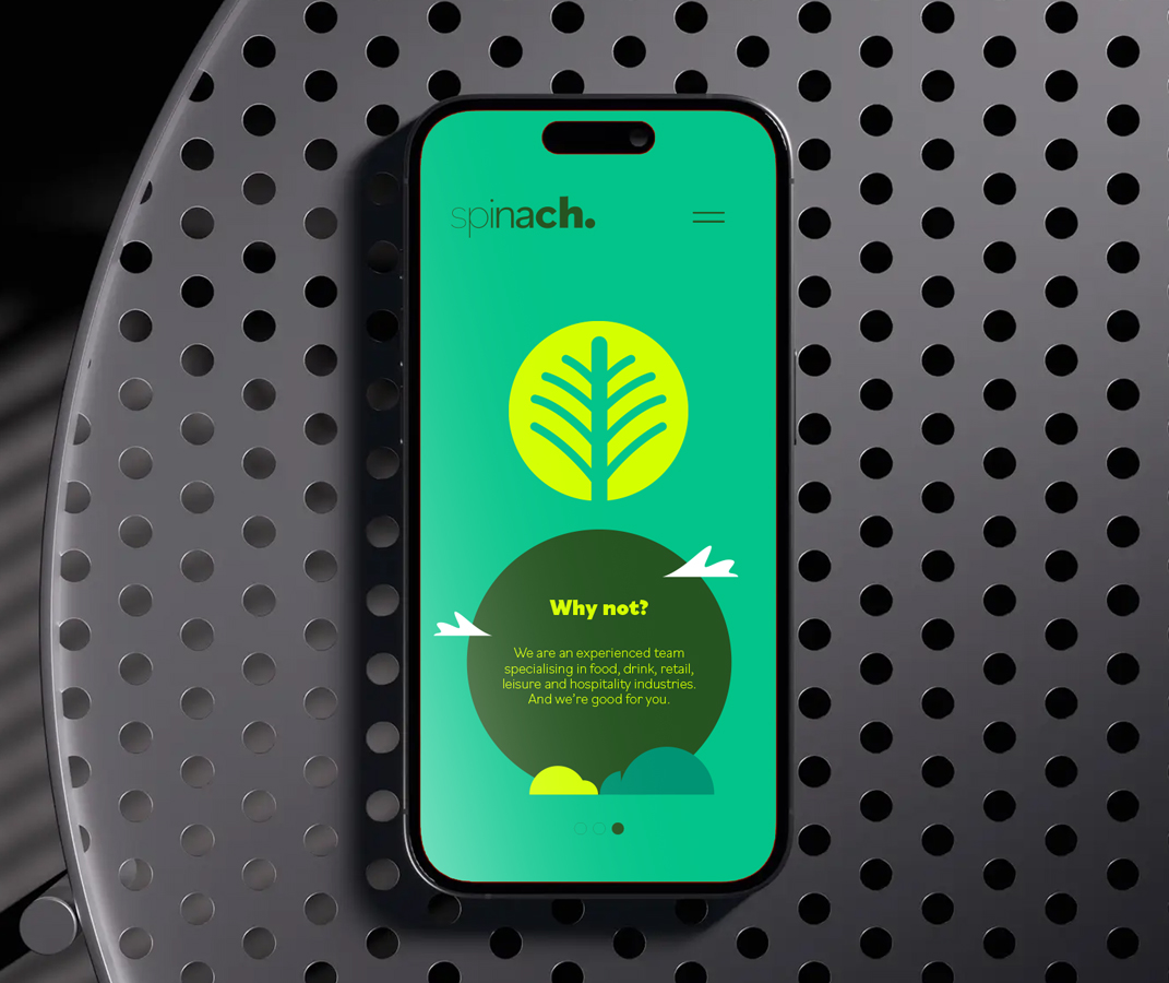
- Website Design
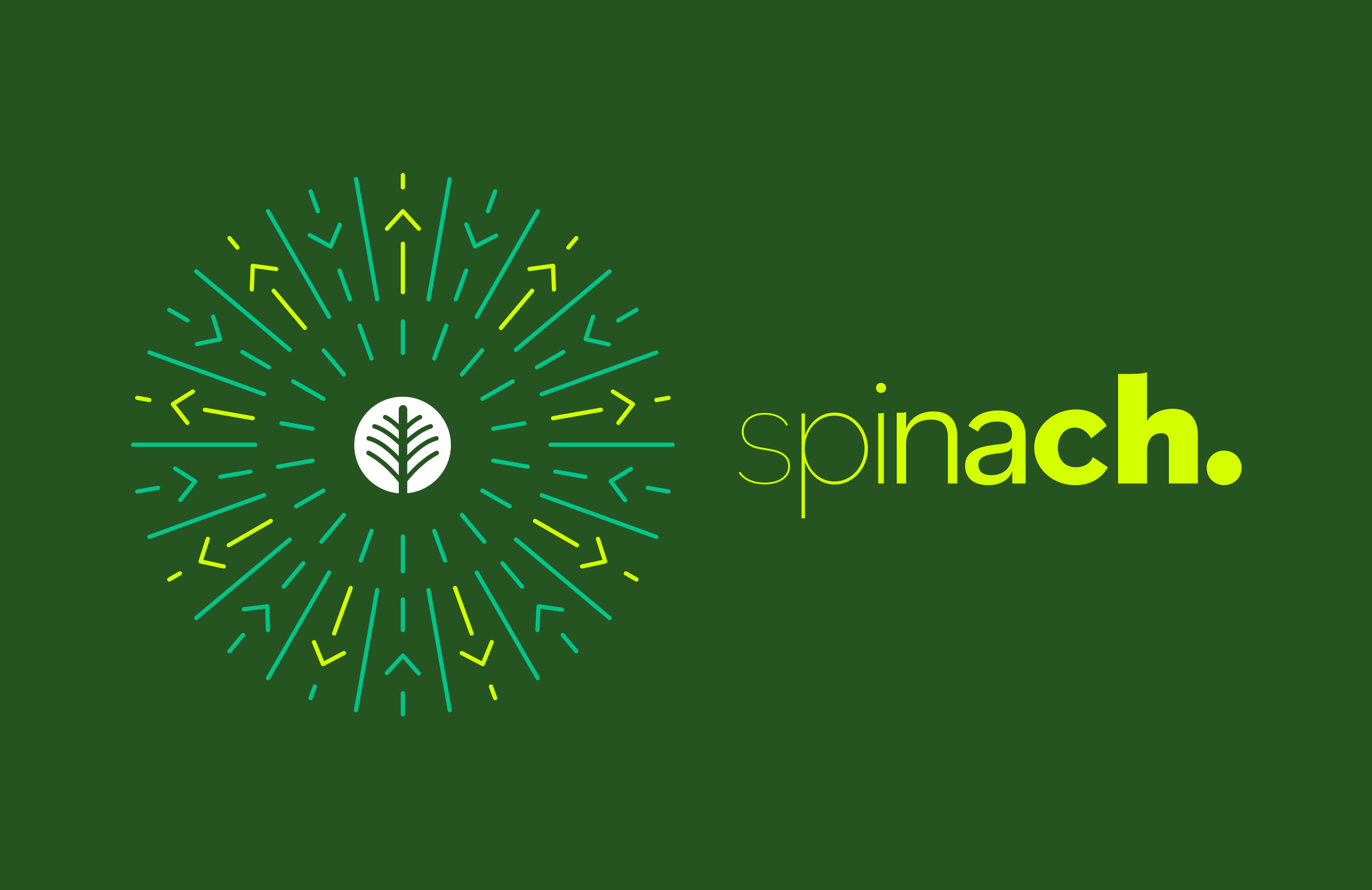
Spinach
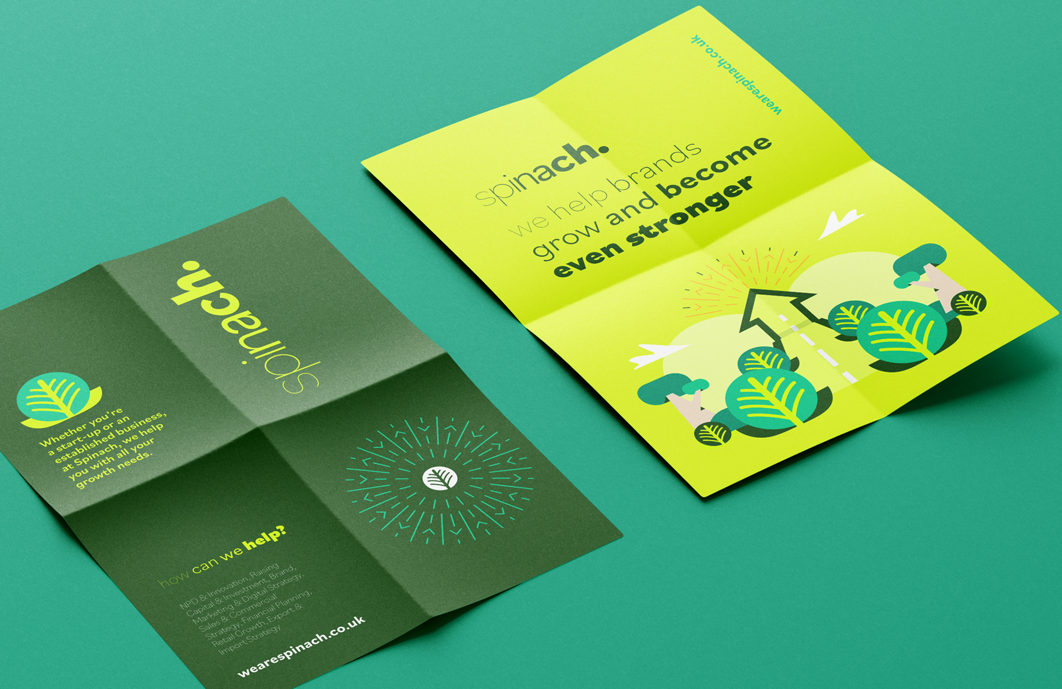
A new agency specialising in sniffing out talent and creative opportunities, Spinach approached us to develop and create their new brand identity. With strength and growth very much at the heart of what they do and believe, it felt only right to explore an identity that portrayed exactly that.
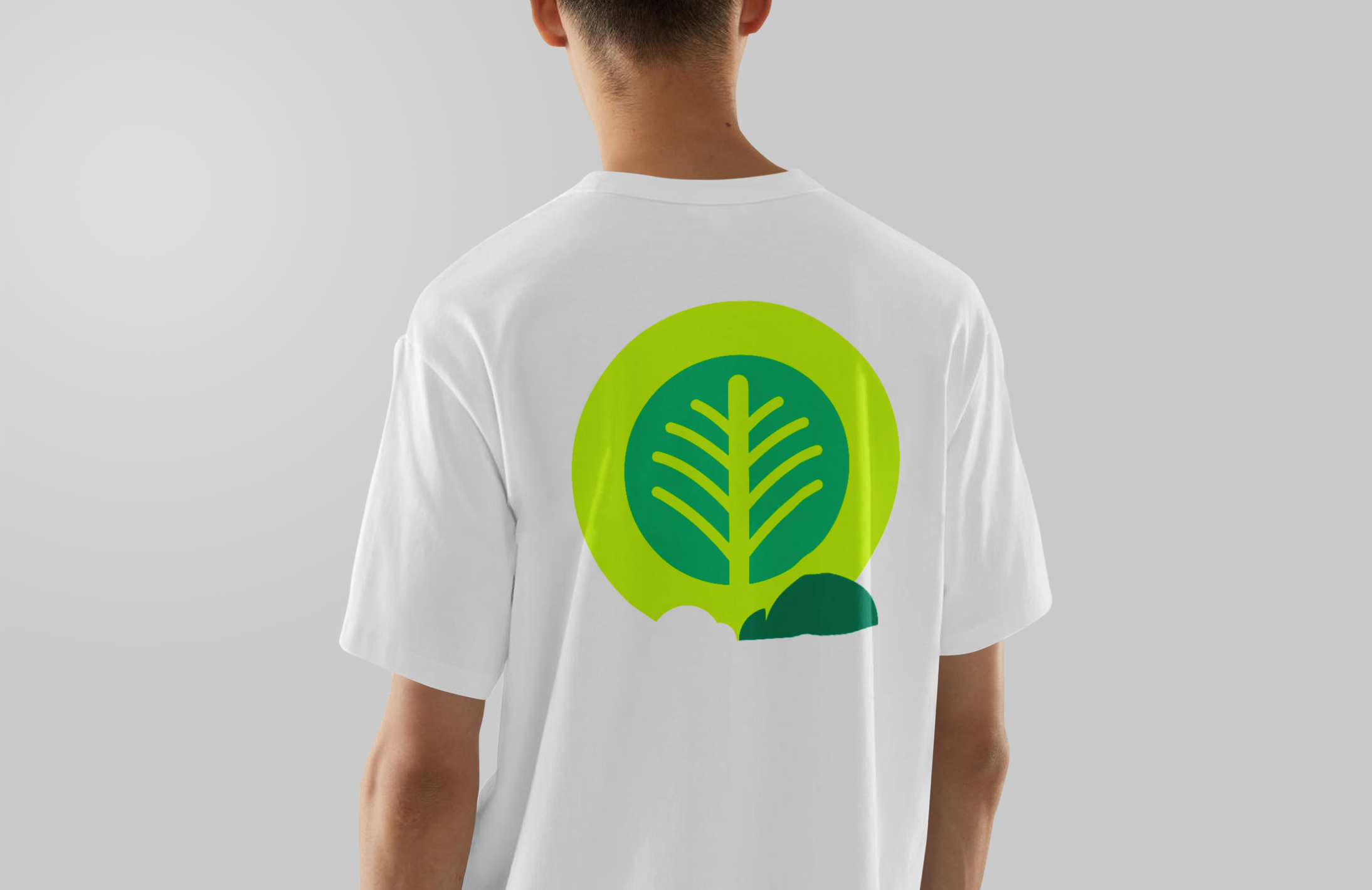
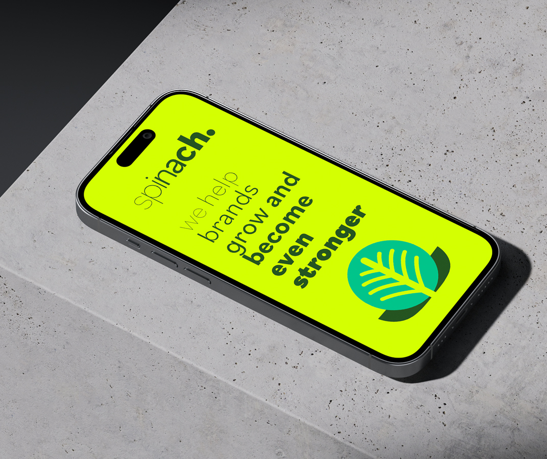
We created a playful brand for them that visualised the progression and strength behind Spinach as an agency and illustrated how their involvement in any project or individual allowed for visual growth.
The typographic treatment and punchy colour palette, which reflects health and vibrancy, mixed with the flat illustrative style, keeps everything feeling fresh and modern whilst giving them longevity with the brand. There’s constant flexibility with the addition of descriptive tone of voice, woven into the visual make-up allowing it to work across all mediums.